 GhostWire ScrollBar - Skinning GhostWire ScrollBar - Skinning
In addition to the two skins shipped with the component, you can easily create your own skins, ensuring that you will always have the scrollbar that look the way you want. All you need to do is to create a movieclip containing the visual assets (detailed below) and drag-n-drop the GhostWire Scroller Behavior onto the movieclip on the Stage. Packaging the new skin as a reusable component (recommended) is also just a few steps away.
Visual Assets
The anatomy of the movieclip you need to create is as follows:
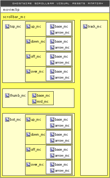
Therefore, you need to create
- a movieclip named top_mc
- a movieclip named bot_mc
- a movieclip named thumb_mc
- a movieclip named track_mc
Within the top_mc and bot_mc, you should have similar child movieclips:
- a movieclip named up_mc
- a movieclip named down_mc
- a movieclip named off_mc
- (optional) a movieclip named over_mc
Within the thumb_mc, you should have the following child movieclips:
- a movieclip named base_mc
- (optional) a movieclip named mid_mc
Note that the height of the thumb_mc during authoring determines its minimum height during runtime.
The bot_mc, top_mc, thumb_mc and track_mc movieclips are then grouped into a movieclip named scrollbar_mc.
Usage Method 1: Inheriting the Behavior
Convert scrollbar_mc into another movieclip, which can be named anyway you want.
Make sure you name this movieclip - it can be any name you choose, if you don't name it, it will automatically be named later as 'instance0' or similar.
Next, just drag and drop the Scroller Behavior onto this movieclip and on the Properties Panel (click on the behavior clip on the Stage) indicate the scrolltarget (target textfield). The behavior has no visual asset in it, except for an invisible clip for identification purpose. It is recommended that you 'select all' (Ctrl-A) and then choose 'Distribute to Layers' (Ctrl-Shift-D). In this way, you can easily find the Behavior clip on the Stage.
*Note: if you later rename your movieclip, make sure to find the Scroller Behavior clip (already on the Stage) and drag it and drop it again on the movieclip.
Usage Method 2: Pack into a component (recommended)
Due to the nature of the way scrollbar components work (you drag-n-drop onto a textfield), it is recommended that you pack your new skin into a new component. This way, you can drag-n-drop from your Library onto a textfield, instead of having to indicate the scrolltarget from the Properties Panel.
Packing your new skin as a new scrollbar component is easy. For guidance, look at the ScrollBar(Silver) component included in the package. The required actionscripts (just a few lines) are all in the ScrollBar component. The easiest way is to 'swap' the scrollbar_mc symbol in the component to the new scrollbar_mc symbol you created. Alternatively, you can duplicate the ScrollBar(Silver) symbol in your Library and then change the symbol name in the Properties, the symbol names in the actionscripts within the symbol, and replace the scrollbar_mc with your own. Unlike FUI components, the structure here is very simple... no worries - changing the skin only takes the swapping of one single symbol!
Usage Method 3: Swap symbol (highly recommended)
You can of course, simply use the component shipped "as is" but use your own skin symbol. After you have created your own skin symbol, click into the component symbol in the Library. Select the skin symbol instance and use the "swap symbol" button (in the properties panel) to swap to the skin symbol you have created.
Do remember that the next time you update the component on the stage (drag-and-drop from the components panel), your swapped symbol will be replaced by the original. But all you need to do then is to swap the single movieclip back. The advantage here is that you will not need to repack your skin into a new symbol, and it actually makes updating easier.
Flash Components
Button
:: CheckBox
:: CollapsibleMenu
:: CollapsiblePane :: ColorPicker :: ComboBox
:: ContextMenu
:: DialogBox
:: InputField
:: ListBox :: Loader :: Menu
:: SlideMenu
:: NumericBox
:: Panel :: ProgressBar :: RadioButton
:: ScrollBar
:: ScrollPane
:: SlidePane
:: Slider
:: TabView
:: TextArea
:: TreeView
:: Window
See also
Documentation :: FAQs :: Testimonials
|
