GhostWire CollapsibleMenu
This Flash component allows you to create a menu with collapsible sections.
Example
The following is an example of the CollapsibleMenu component (filesize 8KB)
Features Accordion Mode
This component can also function as an Accordion Menu, simply by setting the Mode of the component to 'Accordion' instead of 'Collapsible' (see Configurations). When functioning in the Accordion mode, only one section can be selected by the mouse for display at any time (but can be overriden by actionscript). Example:
Menu Item Icons
Each menu item can be assigned its own icon. The icon can be defined in the Properties Panel during authoring. During runtime, each element in the dataArray defining a menu item can have an 'icon' property defining the icon to use.
onSelect Events
The component has an onSelect event, which you can use to specify the action that should be executed when a menu item is selected by the mouse. Alternatively, the component also has some preset triggers - when the Action property of the component is set to 'GetURL', the 'data' property associated with a menu item is assumed to represent an URL and when the item is selected (clicked on), the URL will be loaded. When the Action is set to 'GotoAndPlay' or 'GotoAndStop', the 'data' property is assumed to be a frame number/label.
Easy Menu Definitions
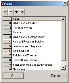
The component uses an easy and intuitive way to define the menu - each section header label is prefixed with a '@'; example:
The data for each menu item can be specified via the Properties Panel:
During runtime, the menu can be changed or set up using the setDataProvider() method.
XML
Alternatively, you can also populate the component using an external XML file. The XML file should look like this. During authoring time, you may specify the XML file to load in the component parameter 'xmlPath'. During runtime, you can use the loadXML(xmlPath) method to populate the component.
Snap to Pixel
The component snaps to pixel when published, ensuring that it looks crisp and sharp when the movie plays. Usually to achieve this, you need to ensure that you place your movieclips at integer coordinates (no decimal place) during authoring time. This is not necessary with GhostWire components, which will automatically snap to pixel when published. For example, if the component was placed at x coordinate 20.2, when published it will be placed at x coordinate 20.0 instead. In addition, the component also resizes itself to integer widths and heights.
Item Opacity
You can also set the opacity of the menu items from the Properties Panel of the component. Example:
Truly Skinnable
Based on the GhostWire Component Architecture, the CollapsibleMenu component is truly skinnable. The visual assets are properly packed away from the behavioral code, making it really easy to create CollapsibleMenus that look exactly the way you want. Example:
