GhostWire TreeView This Flash component allows you to create cascading tree menus. The TreeView component can be populated using an external XML file or an array (via the setDataProvider method).
Example
The following is an example of the TreeView component (filesize 18KB; 14KB + 4KB icons):
Drag-Hold-Expand
If the user click on an item and drag-hold to a collapsed node and hold it there for a time (configured with the property 'autoExpandDelay'), the node will auto expand. This is a behavior common to windows explorer trees. Try this in the above example.
onSelect Events
The component has an onSelect event, which you can use to specify the action that should be executed when an item is selected. Alternatively, the component also has some preset triggers - when the 'action' property of the component is set to 'GetURL', the 'data' property associated with a menu item is assumed to represent an URL and when the item is selected (clicked on), the URL will be loaded. When the action is set to 'GotoAndPlay' or 'GotoAndStop', the 'data' property is assumed to be a frame number/label. Try this on the example above (GetURL has been set).
Editable Labels
If you set 'onDblSelectEvent' to 'Edit' (see configurations), the tree items' labels are editable by the users: * click on image for "live" version
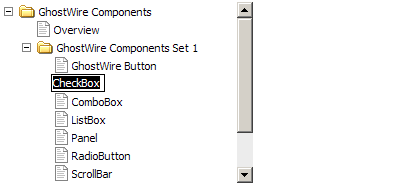
Custom Icons
You may set any exported symbol in the library as the icon of any item in the tree (each item has its own 'icon' property). If no icon has been defined for an item, the defaultIcon or defaultChildIcon will be used.
Snap to Pixel
The component snaps to pixel when published, ensuring that it looks crisp and sharp when the movie plays. Usually to achieve this, you need to ensure that you place your movieclips at integer coordinates (no decimal place) during authoring time. This is not necessary with GhostWire components, which will automatically snap to pixel when published. For example, if the component was placed at x coordinate 20.2, when published it will be placed at x coordinate 20.0 instead. In addition, the component also resizes itself to integer widths and heights.
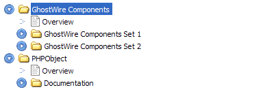
Truly Skinnable
Based on the GhostWire Component Architecture, it is easy to change the control icon (collapse/expand) of the TreeView component. Notice that the 'custom icons' example above uses an XP styled skin. Here is another example: * click on image for "live" version
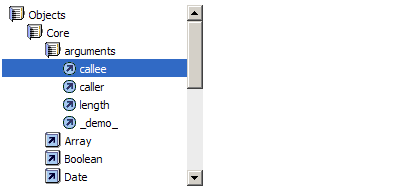
With some creativity, you may also create an interface like that used for the Flash MX Reference Panel: * click on image for "live" version
