GhostWire Button
This Flash component allows you to create classic
windows lookalike buttons that can respond to
single-clicks, double-clicks, ctrl-clicks, and
ctrl-double-clicks.
Example
This example demonstrates the different click
events (filesize 7KB):
Features Draggable
The component has an 'isDraggable' property and
corresponding 'setDraggable()' method. When the
property is set to true, the button is draggable.
Familiar Event
Handler Syntax
Handling the single-clicks, double-clicks, ctrl-clicks,
and ctrl-double-clicks follows the familiar myMovieClip.onEvent = function() {}
syntax. This makes referencing much easier than
using 'clickhandler' properties.
Fit Label
By default, the button will automatically resize
itself to fit the label. Alternatively, you can
fix the button size and switch off the resizing.
Flexible
It is easy to configure
the component through its Properties panel. You
can use the button with a label, with an icon,
or both. You can also do without both label and
icon, creating your own button skins you can easily
create multistate buttons that look the way you
want with the features listed on this page.
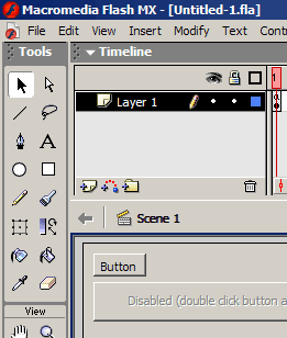
Live Preview
The component comes with live preview, allowing
you to see in the authoring environment what you
will be getting when the movie is published. Changes
to the colors, width and height, label and other
properties of the component is updated live as
you work:
On/Off State
The Button component has an 'isEnabled' property
and a corresponding 'setEnabled()' method to allow
switching on/off event-handling for the component.
The label also turns to 'disabled' look if the
property is set to false.
On/Off
ToggleMode State
The Button component can be set to be a toggleMode
button ('isToggleMode' property). When set to
'true' the button can be used as a 'two-state'
control. Clicking on the button toggle its state.
The getValue() method and onSelect() event are
available to toggleMode buttons. Here is an example:
Grouped
Buttons
The component also allows you to assign the (toggleMode)
buttons into a group. Only one button in the same
group may be selected at any given time.
Button
Icon
You can also specify a movieclip symbol in the
library to use as an icon in the button. You can
also choose to not use any label, and use only
an icon, thereby effectively creating an icon
button.
Snap
to Pixel
The component snaps to pixel when published, ensuring
that it looks crisp and sharp when the movie plays.
Usually to achieve this, you need to ensure that
you place your movieclips at integer coordinates
(no decimal place) during authoring time. This
is not necessary with the GhostWire Button component,
which will automatically snap to pixel when published.
For example, if the component was placed at x
coordinate 20.2, when published it will be placed
at x coordinate 20.0 instead. In addition, the
component also resizes itself to integer widths
and heights.
Truly
Skinnable
Based on the GhostWire Component Architecture,
the Button component is truly skinnable. We have
included three skins to demonstrates the ease
at which you can change the look of the component.
The following example shows two buttons that look
similar to Windows XP buttons (and the top button
uses a different skin from the button below):

 GhostWire Button
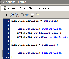