 GhostWire CheckBox - Configurations GhostWire CheckBox - Configurations
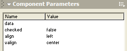
CheckBox
Default configuration for this flash component
(edit via Properties panel) |
| Data |
blank |
|
| isChecked |
false |
| Horizontal Alignment |
left |
| Vertical Alignment |
center |
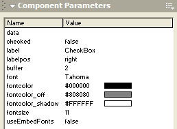
CheckBoxLabel
Default configuration for this flash component
(edit via Properties panel) |
| Data |
blank |
|
| isChecked |
false |
| Label |
CheckBox |
| Label Placement |
right |
| Label Placement Buffer |
2 |
| Label Font |
Tahoma |
| Label FontColor |
#000000 |
| Label FontColor (Off) |
#808080 |
| Label FontColor (Shadow) |
#FFFFFF |
| Label FontSize |
11 |
GhostWire CheckBox
GhostWire CheckBox with Label
data
Specify the value to be associated with the checkbox.
checked
Specify whether the checkbox is checked initially.
align/valign (CheckBox without Label)
Specify the placement of the checkbox within the hotspot area. By adjusting these two parameters, the checkbox can be place at one of nine positions - top-left, top-center, top-right, center-left, center-center, center-right, bottom-left, bottom-center, bottom-right.
label (CheckBox with Label)
Specify the text to appear next to the checkbox.
labelpos (CheckBox with Label)
Specify the position of the text to appear next to the checkbox - top, left, bottom or right.
buffer (CheckBox with Label)
Specify the spacing between text and checkbox.
font
Specify the font type of the text.
fontsize
Specify the font size of the text.
fontcolor
Specify the font color of the text.
fontcolor_off
Specify the font color of the text when the checkbox is disabled.
fontcolor_shadow
Specify the color of the shadow on the text when the checkbox is disabled.
useEmbedFonts
Specify whether the component should use the embedded version of the font. If 'true', make sure that you have embedded the font - it is recommended that you create an empty dynamic textfield on the stage and embed the characters.
Flash Components
Button
:: CheckBox
:: CollapsibleMenu
:: CollapsiblePane :: ColorPicker :: ComboBox
:: ContextMenu
:: DialogBox
:: InputField
:: ListBox :: Loader :: Menu
:: SlideMenu
:: NumericBox
:: Panel :: ProgressBar :: RadioButton
:: ScrollBar
:: ScrollPane
:: SlidePane
:: Slider
:: TabView
:: TextArea
:: TreeView
:: Window
See also
Documentation :: FAQs :: Testimonials
|
