 GhostWire RadioButton - Skinning GhostWire RadioButton - Skinning
In addition to the two skins shipped with the component, you can easily create your own skins, ensuring that you will always have the radiobutton that look the way you want. All you need to do is to create a movieclip containing the visual assets (detailed below) and drag-n-drop the GhostWire RadioButton Behavior onto the movieclip on the Stage. Packaging the new skin as a reusable component (highly recommended) is also just a few steps away.
Visual Assets
The anatomy of the movieclip you need to create is as follows:
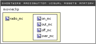
Therefore, you need to create
- a movieclip named on_mc
- a movieclip named out_mc
- a movieclip named off_mc
- (optional) a movieclip named over_mc
Group these movieclips into one movieclip symbol named radio_mc.
Usage Method 1: Inheriting the Behavior
Convert the radio_mc into another symbol on the stage, ie
myMovieClip -> radio_mc -> on_mc/out_mc/off_mc/over_mc
Make sure you name your movieclip - it can be any name you choose, if you don't name it, it will automatically be named later as 'instance0' or similar.
Next, just drag and drop the RadioButton Behavior onto this movieclip and set the parameters on the Properties Panel (click on the behavior clip on the Stage). The behavior has no visual asset in it, except for an invisible clip for identification purpose. It is recommended that you 'select all' (Ctrl-A) and then choose 'Distribute to Layers' (Ctrl-Shift-D). In this way, you can easily find the Behavior clip on the Stage.
*Note: if you later rename your movieclip, make sure to find the RadioButton Behavior clip (already on the Stage) and drag it and drop it again on the movieclip.
Usage Method 2: Pack into a component (recommended)
It is highly recommended that you pack your new skin to a new radiobutton component, simply because it is easy to do so, and even easier to use later.
The quickest way is to 'swap' the symbol used for radio_mc in the GWRadioButton component (or one of the other four shipped in the package) to the one you just created.
Alternatively, you can duplicate the component and then swap the symbol in the new component - if you rename the component, make sure you rename the references in the actions frame as well (don't worry, there are only a few lines!).
Basically, you only need to create your visuals independently of the component, and swap one single symbol in the component. That easy!
Usage Method 3: Swap symbol (highly recommended)
You can of course, simply use the component shipped "as is" but use your own skin symbol. After you have created your own skin symbol, click into the component symbol in the Library. Select the skin symbol instance and use the "swap symbol" button (in the properties panel) to swap to the skin symbol you have created.
Do remember that the next time you update the component on the stage (drag-and-drop from the components panel), your swapped symbol will be replaced by the original. But all you need to do then is to swap the single movieclip back. The advantage here is that you will not need to repack your skin into a new symbol, and it actually makes updating easier.
Flash Components
Button
:: CheckBox
:: CollapsibleMenu
:: CollapsiblePane :: ColorPicker :: ComboBox
:: ContextMenu
:: DialogBox
:: InputField
:: ListBox :: Loader :: Menu
:: SlideMenu
:: NumericBox
:: Panel :: ProgressBar :: RadioButton
:: ScrollBar
:: ScrollPane
:: SlidePane
:: Slider
:: TabView
:: TextArea
:: TreeView
:: Window
See also
Documentation :: FAQs :: Testimonials
|
