 GhostWire ScrollPane - Configurations GhostWire ScrollPane - Configurations
Default configuration for this flash component
(edit via Properties panel) |
| ScrollContent |
(blank) |
| Horizontal Scroll |
auto |
| Vertical Scroll |
auto |
| Drag Content |
onKey |
| Small Scroll Value |
5 |
| Large Scroll Value |
30 |
| Frame Face Color |
#FFFFFF |
|
| Frame Highlight Color |
#404040 |
| Frame Highlight3D Color |
#808080 |
| Frame Shadow Color |
#D4D0C8 |
| Frame DarkShadow Color |
#FFFFFF |
| Padding |
2 |
|
GhostWire ScrollPane
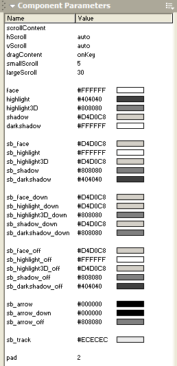
scrollContent
Specify the path to the content to be embedded inside the ScrollPane. This should be the identifier of an exported symbol in the library or the path to an external file (must end with .swf or .jpg).
hScroll
Specify whether to use a horizontal scrollbar.
vScroll
Specify whether to use a vertical scrollbar.
dragContent
Specify whether the content embedded inside the scrollpane can be dragged.
smallScroll
Specify the amount to scroll, in pixels, when the up/down arrows are pressed.
largeScroll
Specify the amount to scroll, in pixels, when the mouse is pressed over the track.
face/highlight/highlight3D/shadow/darkshadow
These five parameters collectively determine the look of the border.
sb_*
These parameters collectively determine the look of the scrollbars.
Flash Components
Button
:: CheckBox
:: CollapsibleMenu
:: CollapsiblePane :: ColorPicker :: ComboBox
:: ContextMenu
:: DialogBox
:: InputField
:: ListBox :: Loader :: Menu
:: SlideMenu
:: NumericBox
:: Panel :: ProgressBar :: RadioButton
:: ScrollBar
:: ScrollPane
:: SlidePane
:: Slider
:: TabView
:: TextArea
:: TreeView
:: Window
See also
Documentation :: FAQs :: Testimonials
|
