 GhostWire NumericBox - Configurations GhostWire NumericBox - Configurations
GhostWire NumericBox
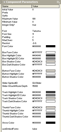
Initial Value (enabled)
Specify the initial value of the numericbox.
Prefix (prefix)
Specify the text that should appear before the value of the numericbox.
Suffix (suffix)
Specify the text that should appear after the value of the numericbox.
Maximum Value (maxValue)
Specify the maximum value of the numericbox.
Minimum Value (minValue)
Specify the minimum value of the numericbox.
Integer Only? (isInteger)
Specify whether the value of the numericbox is integer only.
Font (font)
Specify the font type of the text in the inputfield.
Padding (pad)
Specify the empty space, in pixels, around the text, away from the borders of the box.
MaxChars (maxChars)
Specify the maximum number of characters that can be input in the field.
Restrict (restrict)
Specify the range of characters that can be input in the field.
Font Size (fontsize)
Specify the font size of the text in the inputfield.
Font Color (fontcolor)
Specify the font color of the text in the inputfield.
sliderSymbolID
Specify the symbol identifier of the slider component to use with the numericbox. You should change this only if you are using an alternative slider (that you have created).
sliderDepth
Specify the depth that the slider should occupy.
spawnAtRoot
Specify whether the slider should be spawned at the _root level. If set to 'true', you no longer need to worry about depth management (the slider portion of the numericbox will appear on top of other movieclips, as long as the sliderDepth is set correctly). However, you must also ensure that the slider symbol is available in the library of the _root level. This normally won't have any problem unless you are loading an external movieclip containing the numericbox, when the _root level doesn't access to the symbol. The safest way would be to preload all your components at the _root level and use shared symbols for external movieclips.
useEmbedFonts
Specify whether the component should use the embedded version of the font. If 'true', make sure that you have embedded the font - it is recommended that you create an empty dynamic textfield on the stage and embed the characters.
Flash Components
Button
:: CheckBox
:: CollapsibleMenu
:: CollapsiblePane :: ColorPicker :: ComboBox
:: ContextMenu
:: DialogBox
:: InputField
:: ListBox :: Loader :: Menu
:: SlideMenu
:: NumericBox
:: Panel :: ProgressBar :: RadioButton
:: ScrollBar
:: ScrollPane
:: SlidePane
:: Slider
:: TabView
:: TextArea
:: TreeView
:: Window
See also
Documentation :: FAQs :: Testimonials
|
