 GhostWire TreeView - Configurations GhostWire TreeView - Configurations
GhostWire TreeView
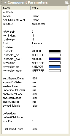
xmlPath
Specify the path to the XML file to use. The treeview will be populated based on the contents of this XML file.
action
Specify the behavior when an item is selected (single-clicked). You can choose 'GetURL', 'GotoAndPlay', 'GotoAndStop' or 'Event'. If you choose 'Event', the component will look for instructions in your onSelect event handler. Otherwise, it will pass 'data' property of the selected item to the respective action (getURL, gotoAndPlay or gotoAndStop).
onDblSelectEvent
Specify the behavior when an item is double-clicked. You can choose 'Event', 'Expand' or 'Edit'. If you choose 'Expand', a node with children will expand. If you choose 'Edit', double-clicking an item will allow the user to edit the label of the item. If you choose 'Event', the component will look for instructions in your onDblSelect event handler.
initState
Specify the initial state of the treeview. You can start the treeview will all nodes collapsed (collapseAll), expanded (expandAll), or if you choose 'custom', all nodes will be collapsed except for those where the 'expanded' property has been set to 'true'.
leftMargin
Specify the left margin (by default, zero). If positive, treeview will be positioned X pixels to the right. Specify negative number (position to the left) if you set showControl to false and wish to compensate for the extra empty space that is shown because of that.
itemIndent
Specify the indentation that should be used for each sublevel.
rowHeight
Specify the height of each item.
font
Specify the font to use for the labels.
fontsize
Specify the size of the font.
fontcolor
Specify the color of the font.
fontcolor_on
Specify the color of the font when item is selected.
fontcolor_over
Specify the color of the font when mouse cursor is over the item. Only applicable if enableHover is 'true'.
itemcolor
Specify the color of the font.
itemcolor_on
Specify the color of the background of the item when selected.
itemcolor_over
Specify the color of the background of the item when mouse cursor is over it. Only applicable if enableHover is 'true'.
autoExpandDelay
Specify the time, in milliseconds, that the user has to mouse click-hold-and-drag over a collapsed item before it would automatically expand.
expandOnSelect
Specify whether a node should automatically expand when selected. If 'toggle' is chosen, the node will collapse/expand (reverse previous state) when selected.
enableHover
Specify whether mouse rollovers trigger any visual effects.
underlineOnHover
Specify whether labels should appear underlined when mouse cursor is over them.
enableItemBase
Specify whether the whole width of the treeview instance is sensitive to mouse clicks. If 'false', only the labels are the hotspots.
showItemBase
Specify whether the background of an item should be extended to the whole width of the treeview instance. If 'false', only the width of the labels are used.
showControl
Specify whether the collapse/expand control is shown. If 'false', it is recommended that you set expandOnSelect to 'toggle' to allow users to collapse/expand the nodes.
selectMultiple
Specify whether more than one item can be selected. If 'true', users can use the CTRL and SHIFT keys together with mouse clicks to select multiple items. In this case, the treeview works more like a list than a menu. To get the list of selected items, please use the getSelectedItems() method.
defaultIcon
Specify the default icon to use where no icon property is set for an item. The defaultIcon value should be a string specifying the symbolID of an exported movieclip in the library. This default icon is used for items with children.
defaultChildIcon
Specify the default icon to use where no icon property is set for an item. The defaultChildIcon value should be a string specifying the symbolID of an exported movieclip in the library. This default icon is used for items without children.
iconPad
Specify the space, in pixels, between icon and label. This is also the space between the collapse/expand control and the item.
useEmbedFonts
Specify whether the component should use the embedded version of the font. If 'true', make sure that you have embedded the font - it is recommended that you create an empty dynamic textfield on the stage and embed the characters.
Flash Components
Button
:: CheckBox
:: CollapsibleMenu
:: CollapsiblePane :: ColorPicker :: ComboBox
:: ContextMenu
:: DialogBox
:: InputField
:: ListBox :: Loader :: Menu
:: SlideMenu
:: NumericBox
:: Panel :: ProgressBar :: RadioButton
:: ScrollBar
:: ScrollPane
:: SlidePane
:: Slider
:: TabView
:: TextArea
:: TreeView
:: Window
See also
Documentation :: FAQs :: Testimonials
|
