 GhostWire Menu - Configurations GhostWire Menu - Configurations
Menu
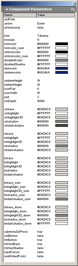
xmlPath
Specify the path to the XML file to use. The Menu will be populated based on the contents of this XML file.
action
Specify the behavior when an item is selected. You can choose 'GetURL', 'GotoAndPlay', 'GotoAndStop' or 'Event'. If you choose 'Event', the component will look for instructions in your onSelect event handler. Otherwise, it will pass the 'data' property of the selected item to the respective action (getURL, gotoAndPlay or gotoAndStop). If the item selected has a 'callback' property defined, this callback method will be called instead. The callback method must be defined at the _root level.
isHorizontal
Specify whether the menu is a horizontal/pulldown menu.
font
Specify the font to use for the labels.
fontsize
Specify the size of the font.
fontcolor
Specify the color of the font (topmenu).
fontcolor_over
Specify the color of the font when mouse cursor is over the item (topmenu).
smfontcolor
Specify the color of the font (submenu).
smfontcolor_over
Specify the color of the font when mouse cursor is over the item (submenu).
disabledColor
Specify the color of the font when the menu item is disabled. Also affects the color of the separator (for default skin only).
disabledShadow
Specify the color of the font shadow when the menu item is disabled. Also affects the color of the separator (for default skin only)
itemcolor
Specify the color of the background of the item when the mouse cursor is over it (topmenu).
smitemcolor
Specify the color of the background of the item when the mouse cursor is over it (submenu).
smItemHeight
Specify the height of each submenu item.
tmItemHeight
Specify the height of each topmenu item.
iconPad
Specify the space, in pixels, between icon and label.
iconWidth
Specify the space, in pixels, to allocate for icons.
pad
Specify the margin, in pixels, around the menu items.
smDepth
Specify the depth level that the submenus should occupy in the application. Usually, it should be safe to leave it to its default value 16000.
smface, smhighlight, smhighlight3D, smshadow, smdarkshadow
These properties collectively specify the colors/look of the submenus.
tmface, tmhighlight, tmhighlight3D, tmshadow, tmdarkshadow
These properties collectively specify the colors/look of the topmenu.
bnface, bnhighlight, bnhighlight3D, bnshadow, bndarkshadow
These properties collectively specify the colors/look of the button that will appear in the menu scroller.
bnface_over, bnhighlight_over, bnhighlight3D_over, bnshadow_over, bndarkshadow_over
These properties collectively specify the colors/look of the button that will appear over the menu item when the mouse cursor is over it (if smButton/tmButton enabled).
bnface_down, bnhighlight_down, bnhighlight3D_down, bnshadow_down, bndarkshadow_down
These properties collectively specify the colors/look of the button that will appear over the menu item when the mouse cursor is pressed down on it (if smButton/tmButton enabled). Also affects the look of the button that will appear in the menu scroller, when the mouse cursor is over it.
submenuOnPress
Specify whether the submenu is triggered onPress ('true') or onRollOver ('false') on the topmenu items.
smButton
Specify whether to use the button as rollovers in the submenu.
tmButton
Specify whether to use the button as rollovers in the topmenu.
tmHasBase
Specify whether to show the base of the topmenu. You can set this to 'false' and then place your own image under the component as the base.
tmHasShadow
Specify whether to show a shadow under the topmenu.
handCursor
Specify whether to use the handcursor.
useEmbedFonts
Specify whether the component should use the embedded version of the font. If 'true', make sure that you have embedded the font - it is recommended that you create an empty dynamic textfield on the stage and embed the characters.
Flash Components
Button :: CheckBox :: CollapsibleMenu :: CollapsiblePane :: ColorPicker :: ComboBox :: ContextMenu :: DialogBox :: InputField :: ListBox :: Loader :: Menu :: SlideMenu :: NumericBox :: Panel :: ProgressBar :: RadioButton :: ScrollBar :: ScrollPane :: SlidePane :: Slider :: TabView :: TextArea :: TreeView :: Window
See also
Documentation :: FAQs :: Testimonials
|
