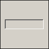
 GhostWire Button - Configurations GhostWire Button - Configurations
Default configuration for this flash component
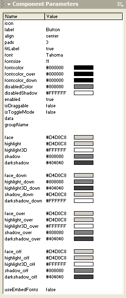
(edit via Properties panel) |
| Icon |
(blank) |
|
| Label |
Button |
|
| Label Offset X |
3 |
|
| Label Alignment |
center |
|
| fitLabel? |
true |
|
| Font |
Tahoma |
|
| Font Size |
11 |
|
| Font Color |
#000000 |
|
| Font Color (over) |
#000000 |
|
| Font Color (down) |
#000000 |
|
| Disabled Color |
#808080 |
|
| Disabled Shadow |
#FFFFFF |
|
| isDraggable? |
false |
|
| isEnabled? |
true |
|
| isToggleMode? |
false |
|
| Data |
(blank) |
|
| Group Name |
(blank) |
|
| Face |
#D4D0C8 |
 |
| Highlight |
#D4D0C8 |
| Highlight3D |
#FFFFFF |
| Shadow |
#808080 |
| DarkShadow |
#404040 |
| Face (down) |
#D4D0C8 |
 |
| Highlight (down) |
#808080 |
| Highlight3D (down) |
#404040 |
| Shadow (down) |
#D4D0C8 |
| DarkShadow (down) |
#FFFFFF |
| Face (over) |
#D4D0C8 |
|
| Highlight (over) |
#D4D0C8 |
| Highlight3D (over) |
#FFFFFF |
| Shadow (over) |
#808080 |
| DarkShadow (over) |
#404040 |
| Face (off) |
#D4D0C8 |
|
| Highlight (off) |
#D4D0C8 |
| Highlight3D (off) |
#FFFFFF |
| Shadow (off) |
#808080 |
| DarkShadow (off) |
#404040 |
GhostWire Button
GhostWire Button(XP)
icon
Specify the movieclip symbol in the library to use as an icon for the button. The symbol must be exported; if "export in first frame" option is not checked, make sure that an instance of the movieclip is placed on the timeline before the button.
label
Specify the text that should appear on the button. If you only want an icon on the button, leave this blank.
align
Specify the alignment of the text on the button. You can choose "left", "right" or "center".
padx
Specify the empty space (margin), in pixels, around the text on the button.
fitLabel
Specify whether the button should resize itself to fit the size of the label.
font
Specify the font type of the text on the button.
fontsize
Specify the font size of the text on the button.
fontcolor
Specify the font color of the text on the button.
fontcolor_over
Specify the font color of the text on the button when the mouse cursor is over it.
fontcolor_down
Specify the font color of the text on the button when it is pressed down.
disabledColor
Specify the font color of the text when the button is disabled.
disabledShadow
Specify the color of the shadow on the text when the button is disabled.
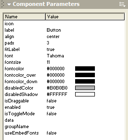
enabled
Specify whether the button is enabled.
isDraggable
Specify whether the button is draggable.
isToggleMode
Specify whether the button is a "toggleMode" button. If "true", the button will have an "on/off" state, and if "on" the "data" property of the button applies.
data
Specify the value to be associated with the toggleMode button.
groupName
Specify the group of the toggleMode button. Undefined by default. If defined, the toggleMode button is assigned to a group of buttons - only of them can be at the "on" (down) state at any one time.
useEmbedFonts
Specify whether the component should use the embedded version of the font. If 'true', make sure that you have embedded the font - it is recommended that you create an empty dynamic textfield on the stage and embed the characters.
Flash Components
Button
:: CheckBox
:: CollapsibleMenu
:: CollapsiblePane :: ColorPicker :: ComboBox
:: ContextMenu
:: DialogBox
:: InputField
:: ListBox :: Loader :: Menu
:: SlideMenu
:: NumericBox
:: Panel :: ProgressBar :: RadioButton
:: ScrollBar
:: ScrollPane
:: SlidePane
:: Slider
:: TabView
:: TextArea
:: TreeView
:: Window
See also
Documentation :: FAQs :: Testimonials
|
