 GhostWire Components Set 1 GhostWire Components Set 1
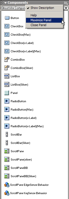
Button
This Flash component allows you to create buttons that can respond to single-clicks, double-clicks, ctrl-clicks, and ctrl-double-clicks. You can specify the label and an icon for the button. Of course, you can also NOT specify a label and use only an icon, effectively creating an icon button. The button can also function as a toggleMode button (on/off state). You can also assign buttons to groups - in a button group, only one of the buttons can be selected at any one time. This component is truly skinnable - we have included three different skins are included in this package to demonstrate the ease at which this component can be modified for its look.
:: Details
CheckBox
This Flash component allows you to create standard UI checkboxes. Based on the GhostWire Component Architecture, this component is truly skinnable. Two different skins (Win/Mac) are included in this package and you can easily create checkboxes that look the way you want using the included CheckBox Behavior. There are also two versions of checkboxes you can use - one with labels, one without (for greater flexibility, like the checkboxes you get in HTML forms, you need not necessarily have to attach labels to a checkbox; you can use text, an icon, image, combinations, etc.).
:: Details
ComboBox
This Flash component allows you to create standard UI comboboxes. In addition to the Windows lookalike combobox, the ComboBox(Silver) component is included to demonstrate the ease at which you can swap the scrollbar used.
:: Details
ListBox
This Flash component allows you to create standard UI listboxes. In addition to the Windows lookalike listbox, the ListBox(Silver) component is included to demonstrate the ease at which you can swap the scrollbar used. The ListBox supports double-click select.
:: Details
Panel
This is a lightweight Flash component that allows you to easily create classic windows lookalike elements, such as inner bevels and outer bevels, speeding up the building of application layouts.
:: Details
RadioButton
This Flash component allows you to create standard UI radiobuttons. Based on the GhostWire Component Architecture, this component is truly skinnable. Two different skins (Win/Mac) are included in this package and you can easily create radiobuttons that look the way you want using the included RadioButton Behavior. There are also two versions of radiobuttons you can use - one with labels, one without (for greater flexibility, like the radiobuttons you get in HTML forms, you need not necessarily have to attach labels to a radiobutton; you can use text, an icon, image, combinations, etc.).
:: Details
ScrollBar
This Flash component allows you to create scrollbars for scrolling textfields. Based on the GhostWire Component Architecture, this component is truly skinnable. Two different skins are included in this package - a classic windows lookalike, and the silver skin. If these do not meet your visual needs, you can easily create scrollbars that look the way you want using the included Scroller Behavior.
:: Details
ScrollPane
This Flash component allows you to create ScrollPanes for scrolling images and movieclips. The component reuses the GhostWire ScrollBar and replacing the default scrollbar used in the scrollpanes shipped in the package is easy. The package ships with three scrollpane components - two with frames (one of which uses the Silver scrollbar), and the other without frame (bare bones).
:: Details
|
|
Purchase
|
Flash Components
Button :: CheckBox :: CollapsibleMenu :: CollapsiblePane :: ColorPicker :: ComboBox :: ContextMenu :: DialogBox :: InputField :: ListBox :: Loader :: Menu :: SlideMenu :: NumericBox :: Panel :: ProgressBar :: RadioButton :: ScrollBar :: ScrollPane :: SlidePane :: Slider :: TabView :: TextArea :: TreeView :: Window
See also
Documentation :: FAQs :: Testimonials
|
