 GhostWire Components Set 7 GhostWire Components Set 7
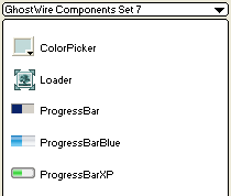
ColorPicker
This Flash component allows you to create color selection UI controls that closely resembles those commonly used in applications. The ColorPicker component is used to indicate the current color for a particular setting and when clicked, displays a popup palette (showing the selection of colors available). The range of colors in the popup palette is customizable.
:: Details
Loader
This Flash component allows you to load an external JPEG or SWF file into an area specified by the boundaries of the component instance. The main purpose of this component is to provide an easy means of loading external content and resizing it automatically to fit an area (specified by the boundaries of the component instance). The content can also be set to maintain its aspect ratio when resizing.
:: Details
ProgressBar
This Flash component allows you to create progress indicators, which are used to inform application users about the status of lengthy operations. The default skin allows you to create progressbars that closely resembles those seen in the Windows OS, including the ability to have loading text shown within the progressbar and having this text change color as the progressbar advances. The component is truly skinnable - we have also included an XP styled progressbar to demonstrate the ease of skinning.
:: Details
|
|
Purchase
|
Flash Components
Button :: CheckBox :: CollapsibleMenu :: CollapsiblePane :: ColorPicker :: ComboBox :: ContextMenu :: DialogBox :: InputField :: ListBox :: Loader :: Menu :: SlideMenu :: NumericBox :: Panel :: ProgressBar :: RadioButton :: ScrollBar :: ScrollPane :: SlidePane :: Slider :: TabView :: TextArea :: TreeView :: Window
See also
Documentation :: FAQs :: Testimonials
|
